A bold refresh for this riverfront property in Brooklyn
Dom and Liz were ready for a change–they wanted updated paint throughout their spacious apartment overlooking the East River from Williamsburg. They had already chosen a handful of colors and needed to complete their palette to bring everything together.
The Brief
- Paint colors to make the home feel “cozy, relaxed, and inspired/invigorated"
- An environment suitable for small gatherings with family and friends, working-from-home, and relaxing
The Challenge
- Max out the potential of their lovely apartment with river and skyline views
- Create cohesion around existing colors, furnishings, and textiles in a range of muted hues
- Resolve an architectural irregularity and a TV-cave problem
The Palette
Benjamin Moore Ballet White trimmed in Oxford White fit the bill in the open concept kitchen/dining/living area, lending warmth and containment without compromising flow. It created a soothing presence and elevated the furnishings.
Warm neutrals that played nicely with Ballet White were used as accents. BM Grizzly Bear Brown made the perfect backdrop to their TV nook, dark enough to define the space and disappear the TV but more lively than black. BM Taos Taupe on an accent wall behind a console worked nicely to show off their artwork and created a pleasing boundary between dining and living areas.
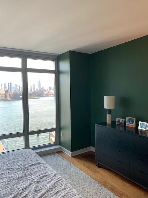
We went big in the bedroom with BM True Green to frame their amazing view of Manhattan across the East River.
Before & After
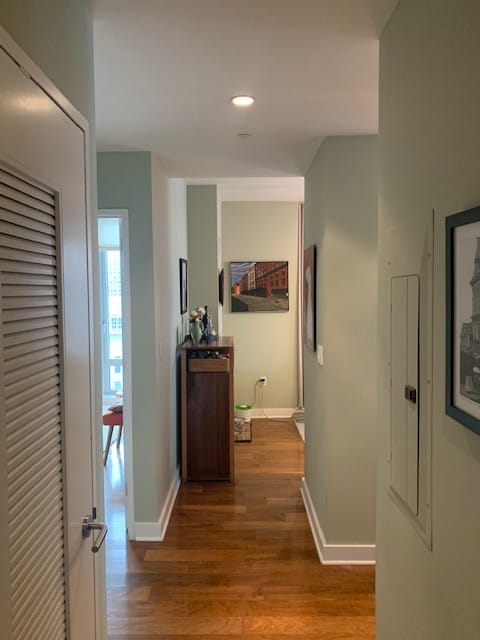
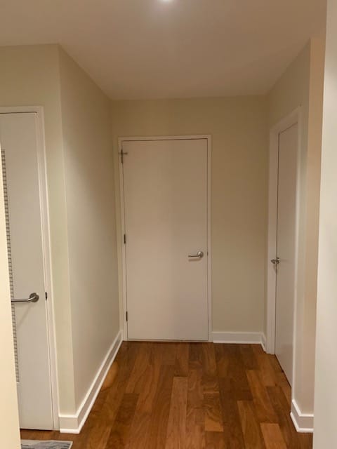
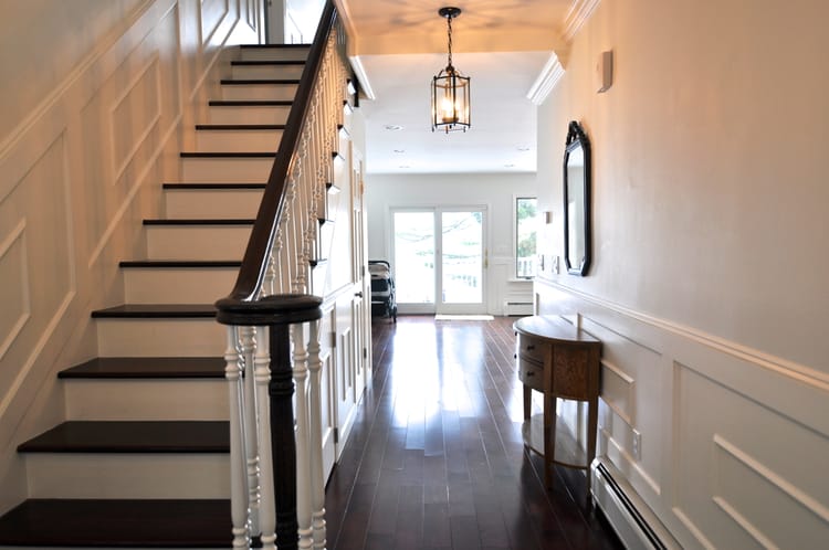
Left (before) Main color was a muted green gray, shown here in the hallways. A nice sage color but slightly sad. And the sharp contrasts between wall, trim and floors caused the eye to look downward and dart around a baseboard maze of right angles. Right (after) The photo is shot from a different angle, but you can see how the space got brighter, cleaner, warmer and softer in Benjamin Moore Ballet White. Having lowered the contrast between wall and trim (and aligned the undertones of wall and floor), the eye (and mood) lifts upward, the harsh maze-like feeling is gone, and the experience is more relaxing.
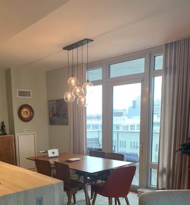
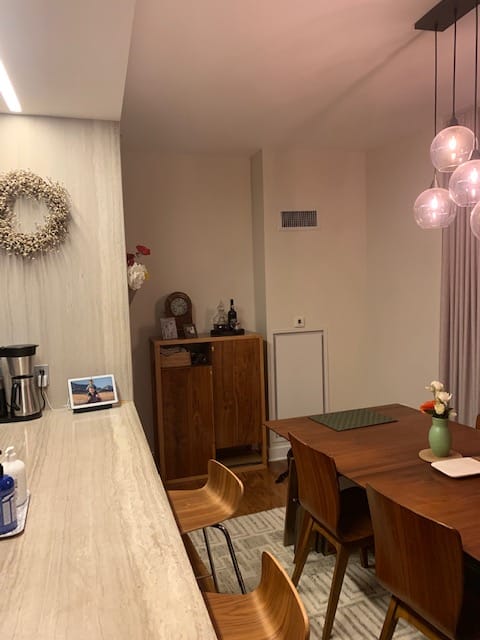
Left (before) They complained that the dinging area felt cramped. Here you can see how the main green-gray color created separation between wall, countertops, drapes and furniture, giving the space a random quality. Right (after) The new neutral creates cohesion, and the dining table naturally emerges as the focal point. Changing only the wall color, the space instantly feels more spacious.
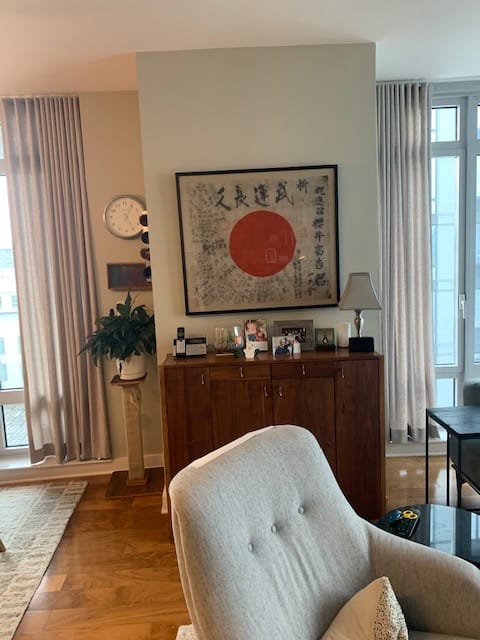
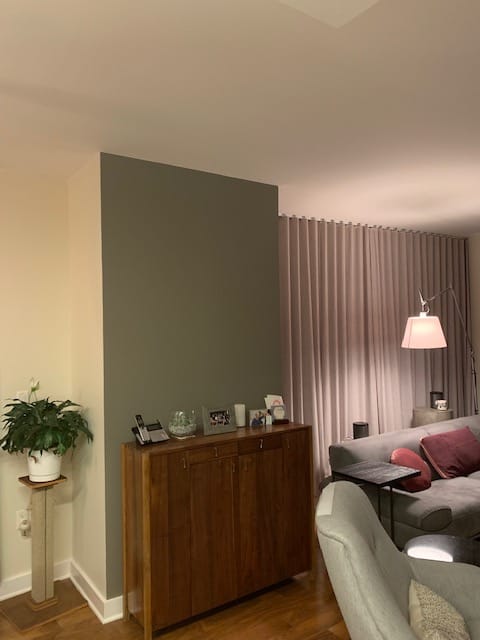
Left (before) The former green-gray lacked presence and felt off. An awkward architectural bulge pitched a console forward into the rest of the space. We talked about moving the console somewhere else and keeping the Ballet White moving across the bulge to create flow. But they like the furniture placement as it was, so we decided to use a medium-toned relatively cool neutral on one aspect of the bulge, like a small feature wall, so it would recede visually and look more intentional. Right (after) Here you can see the junction between Ballet White and Taos Taupe taking this area from ho-hum to sharp and modern. Rehang the fabulous Japanese artwork, and an architectural problem becomes a stunning point of focus.
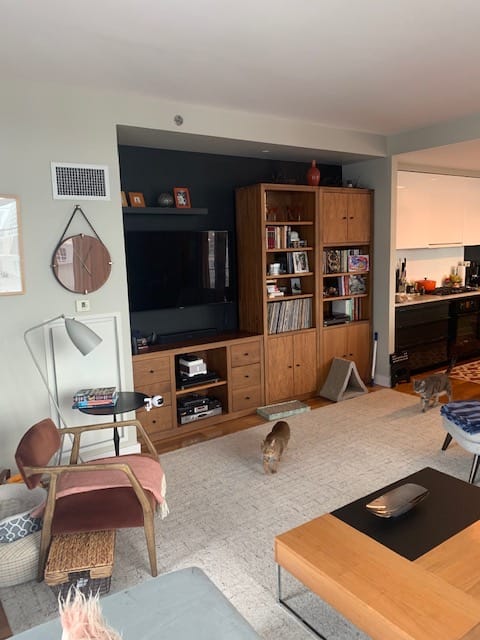
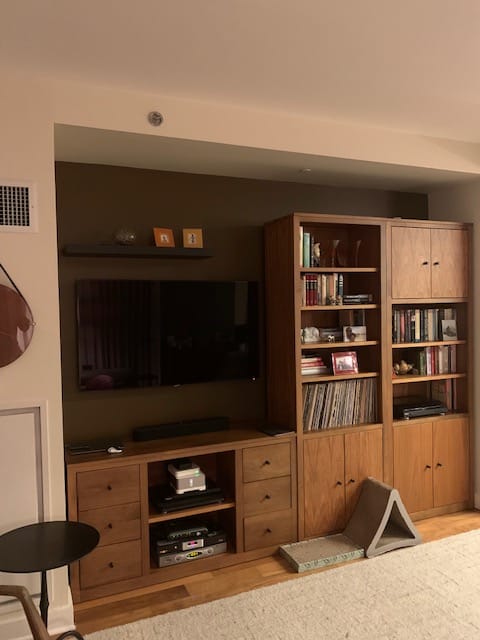
Left (before) The cool black did a great job of disappearing the TV (always worthwhile), but wasn't talking with the wood tones in the entertainment center at all. The result was a black hole effect or a void, a feng shui no-no. Right (after) Changing the black to a fabulous brown (BM Grizzly Bear Brown) enveloped the TV and integrated all the elements.
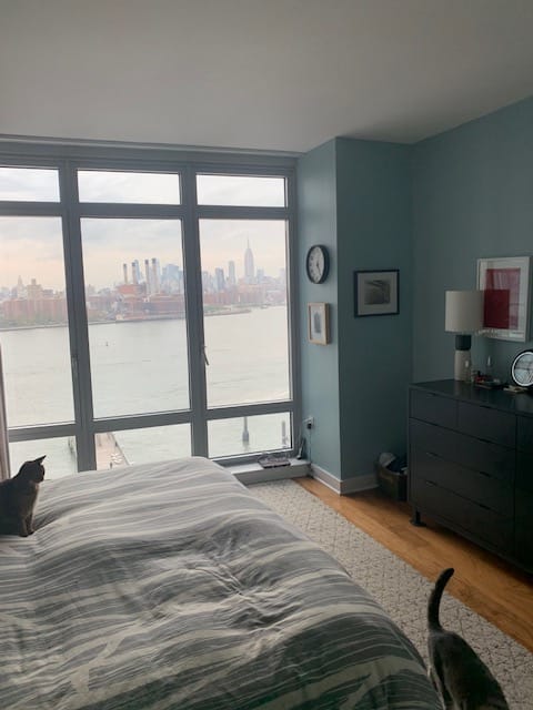
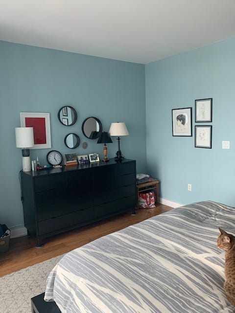
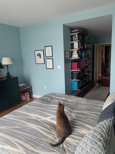

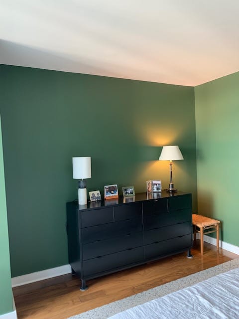
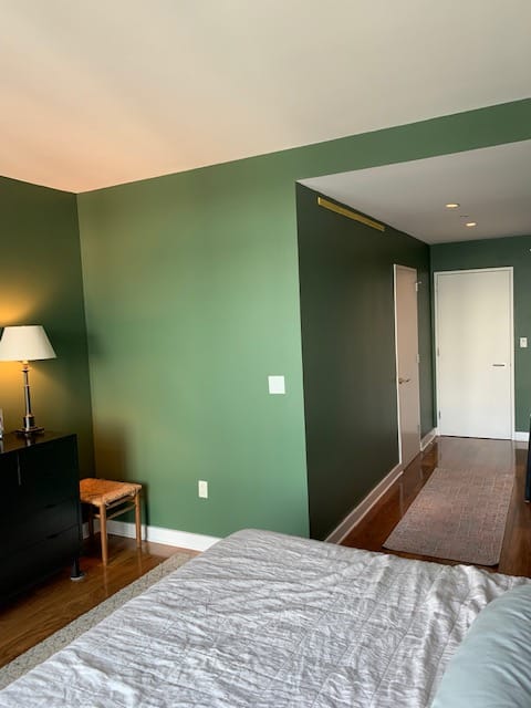
Top row (before) There was nothing wrong with the pale blue walls in the couple's bedroom, but after 10 years, they were craving something new. I could see why—with vast water and sky views just outside the window, the pale blue felt redundant and unsafe, like the bedroom was an extension of the view rather than a secure lookout point. A bedroom should feel cozy, so you can easily fall asleep; and give you a boost of enthusiasm in the morning. Bottom row (after) Saturated greens can be both grounding and energizing, and I was thrilled when they agreed to a strong color here, BM True Green. The paint color created greater contrast with the view, making it like a living painting, and provided a stylish backdrop for their furnishings, including, once the shelving is rehung, their favorite feature—their book-lined hallway. I love how this turned out!
